Realtalk
A mobile application that connects the user and realtors.


Overview
This is an individual project that lasted 1 months.
The project is focused on UX case study, wireframe, prototype, UI and visual design.
What's the problem?
In my experience as a first-time home buyer, it takes an accountable realtor to help me find my dream home. Should I trust this lady introduced by my friend’s cousin; or a random guy I met at an open house, for he or she to be my realtor? Buying a real estate property takes a lot of money and efforts, it might be the biggest financial decision of my life, and it's going to affect my lifestyle after. I feel I need some help to find an agent I can rely on. So, in my opinion, I assume the problem is:
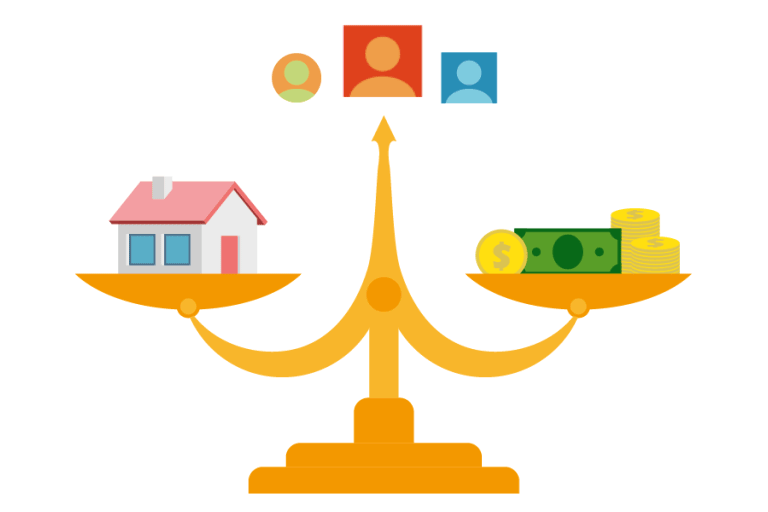
"How can I find an accountable realtor?"
Design Process

1
Problem Assumption
2
Refine Problem Statement
3
Find the Solution
4
Usability Tests
5
High fidelity Prototype
User Interviews
Competitive Research
Low Fidelity Prototype
UI Design
User Research
Based on my assumption on the potential problem, I developed my research plan. My target group is first time home buyer, or home buyers who just moved into a new area, so that they did not know any local realtors. I had a 15-minute interviews with them.
In the interview, I was looking for insights in 3 aspects:
-
If first time home buyer is having difficulty finding realtors.
-
What is the main measurements they use to evaluate realtors?
-
How do they expect to interact with realtors?
I drafted 8 questions around these aspects, to interview my target users. Based on my findings, I organised the facts using affinity map, which helped me categorized the facts into groups relative to the 3 aspects I was looking for.

The insights I got surprised me, I found out that:
-
It’s easy for users to find realtors, the difficult and time-consuming part is to learn about the skill level and personalities of realtors.
And I learnt how users plan to know more about the realtors, by:
-
Starting with more than 1 realtor, users will always try to get a second or third opinion about anything they heard from realtors.
-
Evaluating the realtor mostly by the information they provide, like trends, market potential and neighborhood conditions. Users also appreciate realtors’ personalities and negotiation skills.
Refine Problem Statement
Now that I have a better understanding of the problem, I have updated the problem statement to better emphasize the findings of the my user research:

"How can I find a realtor accountable?"
Persona
The persona is created to capture the insights I got in my user research, let's meet Mike and Julie.

First time home buyers
Tech-savvy
Age: Around 30s
Family: Just married, no kids
Job: Both in technology industry
Scenario
Mike and Julie just got married, they are looking for places in San Jose to settle down. After meeting with a couple of different realtors, they still couldn't decide which one they would like to work along their search. When Mike tried to do some research on realtors they've met, he found a mobile app called Realtalk, which allows him to look up, follow and message all the realtors they knew in one app. He found a lot of transaction history and reviews about active realtors in San Jose as well. Now they have more confident talking to different realtors and eventually narrowing their realtors list.
Pain Points
-
Hard to get ideal realtors based on limited information and time.
-
Easy to lost track of multiple conversations with different agents about same or different properties
Goals
-
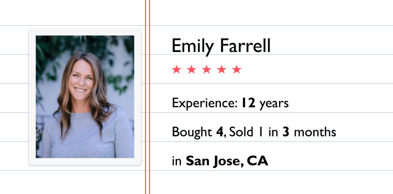
Provide realtor's ratings, reviews, transaction history, experience, etc. to users, help users have a better understanding about realtors.
-
Track realtor's activities, insights or off-market sale by following them; users will get to know which realtor is more informative along their search.
-
Keep all the conversation regarding home buying in one place.
Competitive Research
Once the problem is defined, I started competitive research. There are many websites providing, or claiming to provide detailed information of realtors. Most of websites can be divided in 4 categories:
Real Estate Search
Real Estate Company
Realtor Search
Review Search
I took the 6 websites listed above to evaluate the usability of finding in-depth information about realtors. My user experience is measured with following aspects:
-
Search: If the website allow user to search agent just by name or location.
-
Bio: If the website present the realtor's bio information like experience and specialties.
-
Activity Map: If the website provide an activity map to show realtor's listing, bought and sold.
-
Transactions: If the website provide the transaction history, with comparison to market average.
-
Reviews: If the website provide clients' reviews and ratings of the realtor.
-
Conversations: If the website allow users to keep track of conversations with different realtors.
-
Mobility: If the website has a mobile application offering most of its functions on the go.
Search
Bio
Activity Map
Mobility
Transactions
Reviews
Conversations
Real Estate Search
Realtor Search
Real Estate Company
Review Search
Apparently the real estate search website like Zillow or realtors.com hit most of the points. But there are still spaces for improvement. The information on both websites can be better organised and presented to allow easier access; adding conversation function will allow user to perform most of the home searching tasks on a single platform as well as improve accessibility to realtors. The experience on mobile platform is not as complete as the website for Zillow or realtors.com, the search functions for the realtors is either changed into recommended list or redirected to mobile website out of the app.
Most of the functions that can be improved for real estate search websites, review searcher, which is Yelp, is offering better user experience. The limit of Yelp is, the information or review is very general, while the database is not as complete.
So I created a matrix for the 6 websites I tested, the axes are:
Informative: If there are in-depth information about the realtors; if the information is well organised and presented; if the database for the realtors are complete.
Accessible: If the information is easy to access on website or mobile; if the realtors on the platform is easy to connect; if the information or conversation collected by users can be easily tracked.
Informative
TARGET
Accessible
Inaccessible
Uninformative
Find the Solution
To optimize the user experience in working with realtors, a combination of features and functions from Zillow, realtors.com and Yelp would be a good start; it will guarantee the solution to be both informative and accessible.
So my hypothesis is:
"I believe that by creating a mobile application that allows user to easily access realtors' activities, specialties, transaction and reviews; and help user to keep track of their conversation and open house visits with realtors; we will optimize the experience for first time home buyer and helped them identify their ideal realtors."
Low Fidelity Prototype

I used paper prototype to create the happy path, and tested the prototype with potential users to gather feedback for the wireframe development.
Most of the users were able to walk through the happy path and find the information they were looking for, so I started to build up the site map and wireframe around the happy path.
Sitemap
Based on the feedback from paper prototype, I grouped the basic functions into 4 tabs:
-
Search: Search is the core function in the happy path, it is where the application starts. Users might use search tab to find realtors in designated area, or search for the realtor they met. The in-depth information about relevant realtors will be presented in the search result.
-
Messages: This is where all the conversation with different realtors are kept. It allows users to communicate their home search preference with multiple realtors at the same time, without exposing their personal information. In this way, users will be able to work with as many realtors as they want before they decide on one, and easily manage all the conversation in one page.
-
Following: If users are interested in certain realtors, they can follow the realtors. This tab is where users manage the list of followed realtors, whose activities will be shown in Insights tab.
-
Insights: The activities of realtors that are follows by the users, like realtors' recently closed deals, open houses, recently closed deal, shared news, etc. will appear in this tab. Also, the App will post beginner's guide or news about housing market in this tab. It provides another channel for users to learn more about both realtors and market's insights, which will help users to reflect on the information they got from realtors.

Wireframe


Usability Test
The wireframe is made into prototype in Figma, which allows me to run another round of usability test. In this round, since I already had a solid user flow, I will be mainly focused on making each frame easy to use by observing how users operate the prototype and if there is confusion about the layout of functions or details.
Here is an example of how I evolve the wireframe based on feedback from usability test.
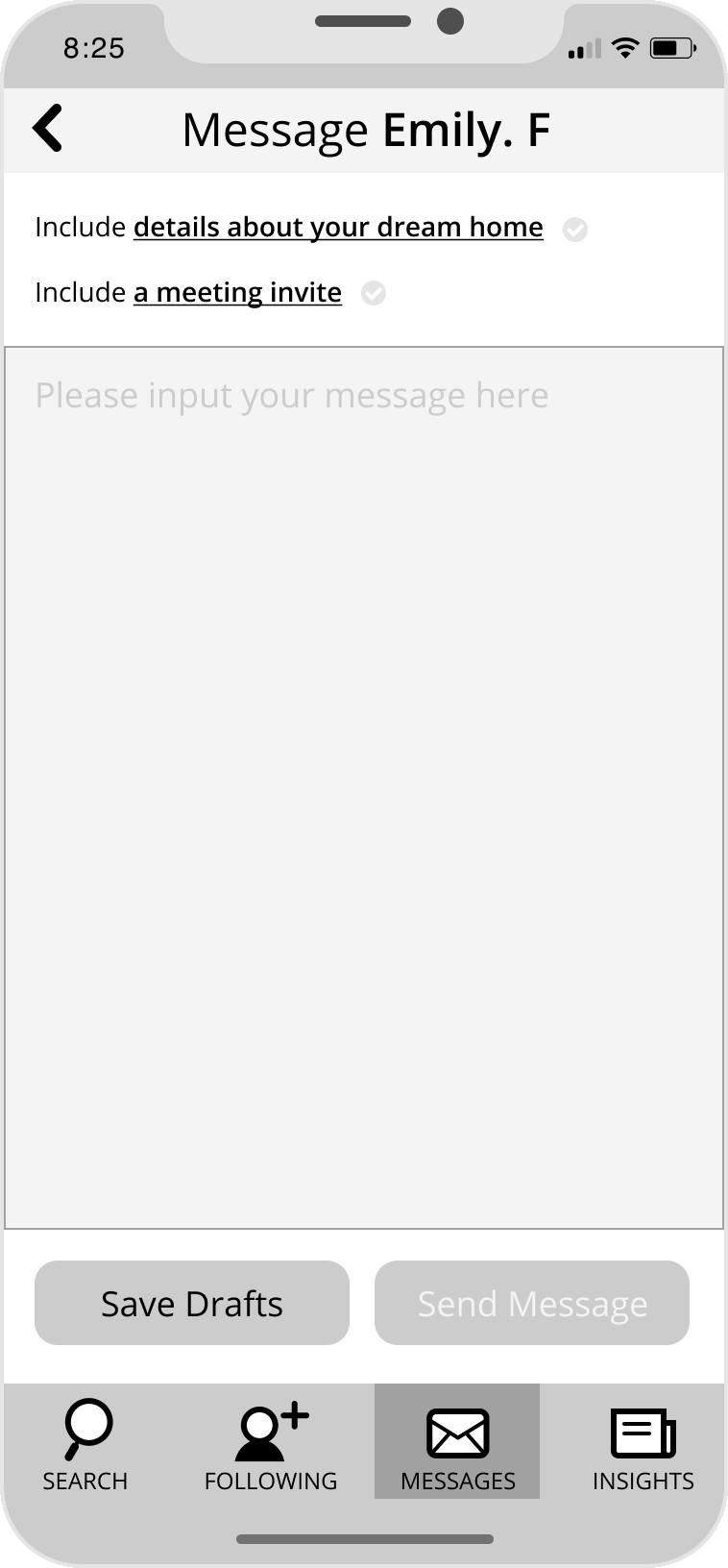
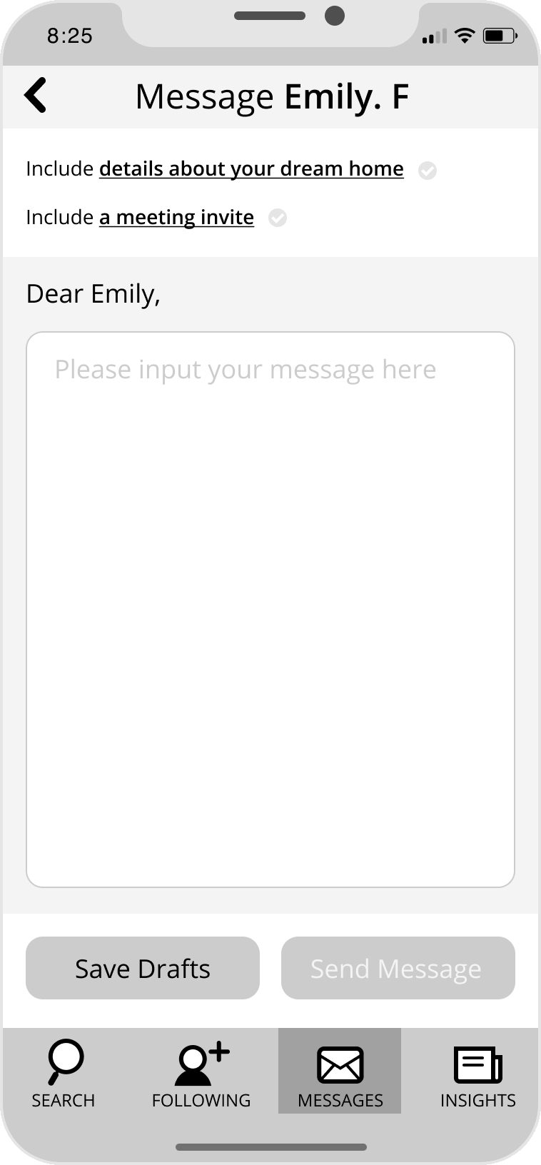
1. I learnt that user may not want to setup a meeting in-person in their first message, so I make the "meeting invite" optional.
2. Realtors tend to ask a set of questions to learn about the scope of users' home search at the beginning of the conversation. So I allowed the users to setup details about their search to improve efficiency of their conversation.
3. Realtor's name will be prefilled, so users may enter a general message to send to other realtors for inquiry.
Draft

Iteration 1.0
Iteration 1.1
User Interface Design
After rounds of usability test and design iterations, I confirmed the final wireframe design and ready for move into UI development. The application I wanted to create should be a handy tool to provide instant information and communication, like a small notepad user can carry with them into different meetings. So I developed the color scheme inspired by the colors of a notepad.
Color Scheme

When I was working on the competitive research, I found that ratings and reviews can only expose part of the story about realtors, as most of the reviews or ratings are very positive. To better quantify realtor's work, user needs more direct data.
That's why I optimize how the application exhibits the "Past Sales", which is the realtor's latest deals as buyer or seller agent. Whenever a deal is closed, the closing price will be compared with the area's average price level. For example, as a buyer agent, if the closing price is lower than the area average, it means that the buyer spends less money on a valuable property; vice versa. So within a certain period of time, if we can demonstrate the percentage of lower-than-average closing price, users will get a better understanding of how likely the realtor will help them save money on their home buying cases (as the seller agent, it will be the higher-than-average closing price).
Compared to the ratings and reviews, this is an objective figure that will directly impact user's benefit working with realtors. So it could be a strong supporting information for user to consider when looking for agent.
Below is the design iterations for the user interface showing the "Past Sales". I worked with data analyst to discuss the best way to present the data, which made me change the bar chart in the wireframe into pie chart; then I simplify the pie chart to make it more direct and intuitive to read.
wireframe

ver. 1

ver. 2

The wireframe and user interface design is finished in Figma, I created a prototype in Figma, then I exported all the assets from Figma to inVision to create the high fidelity prototype. Both links of the prototype is provided.